CASE STUDY
MRKTKings
MRKTKings is a marketing and branding agency that needed a modern, bold website that showcased their work, credibility, and unique value. The experience had to feel authoritative yet creative.
Role
Product Design Lead
Full redesign ownership
Industry
Marketing
Advertisement
Agency
Tools
UIUX Design
Web Design
Wordpress
Shopify
Live
MRKTKings
I redesigned a marketing agency's complete web presence — solving the most common agency problem: a site that described services without demonstrating them. A marketing agency whose own website failed at storytelling and conversion was losing the consideration battle before the first sales call. |
The Problem
User Problem
Prospective clients visiting MRKTKings were primarily asking one question: 'Can you do for us what you claim to do for others?' The previous site answered this poorly. Case studies were buried, service descriptions were generic, and there was no narrative connecting the agency's work to specific client outcomes. The site communicated competence — not capability.
Business Problem
MRKTKings was competing for mid-market clients evaluating 3–5 agencies simultaneously. First impressions were decisive. But the website wasn't making a distinctive case for the agency's approach or results. It looked like every other agency website, which meant it was being filtered out in the consideration phase before a conversation even started.
Discovery & Research
I conducted a content audit and competitive review of 8 comparably-sized agency websites. Key finding: most agencies described services identically — same language, same structure, same claims. The visual experience and proof of work were the only differentiators. I reviewed MRKTKings' strongest existing client work and sales materials to identify their genuine competitive strengths, then designed around making those visible.
Design Process
1. Restructuring the Prospect Journey
I restructured the site architecture around a prospect's actual decision process: Why this agency? → What do you actually do? → Show me proof → How do we start? The original navigation led with services (the least persuasive entry point) and buried case studies. I reversed the priority — proof first, credentials second.
2. Outcome-Led Service Pages
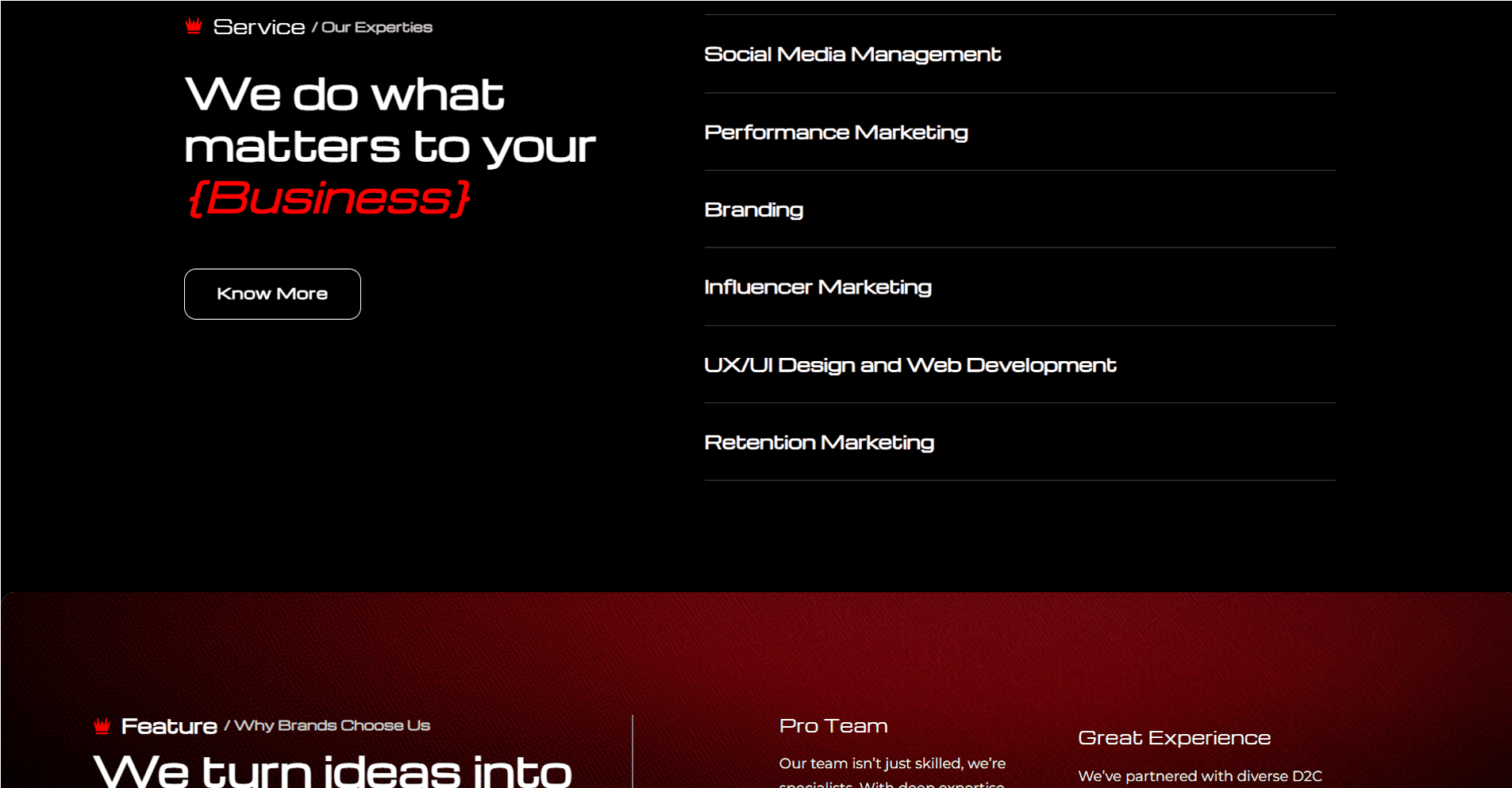
Each service page was redesigned around a pain-solution-outcome framework: opening with the problem clients typically bring, followed by the agency's approach, followed by specific outcomes with real work examples. This replaced generic capability statements with credible, relevant narratives.
3. Scalable Case Study System
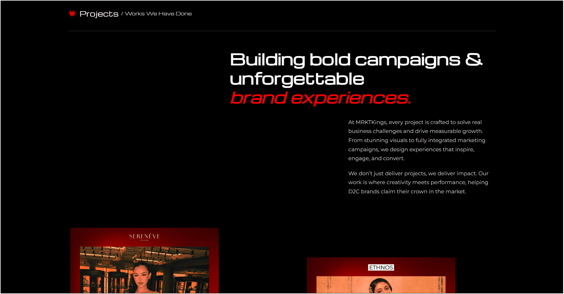
I designed a case study card system with a fixed anatomy (client, challenge, approach, measurable result) enabling new work to be added without design support. The grid included filtering by industry and service type — allowing prospects in specific verticals to find relevant proof quickly.
4. CTA Consolidation
The previous site had 11 distinct call-to-action labels across pages — a fragmented conversion architecture. I reduced to 2 clear primary actions ('See our work' and 'Start a project'), placed at consistent decision points in the scroll journey. Fewer, clearer CTAs are consistently higher-converting than comprehensive menu options.
Key Decisions & Tradeoffs
Proof before services on the homepage
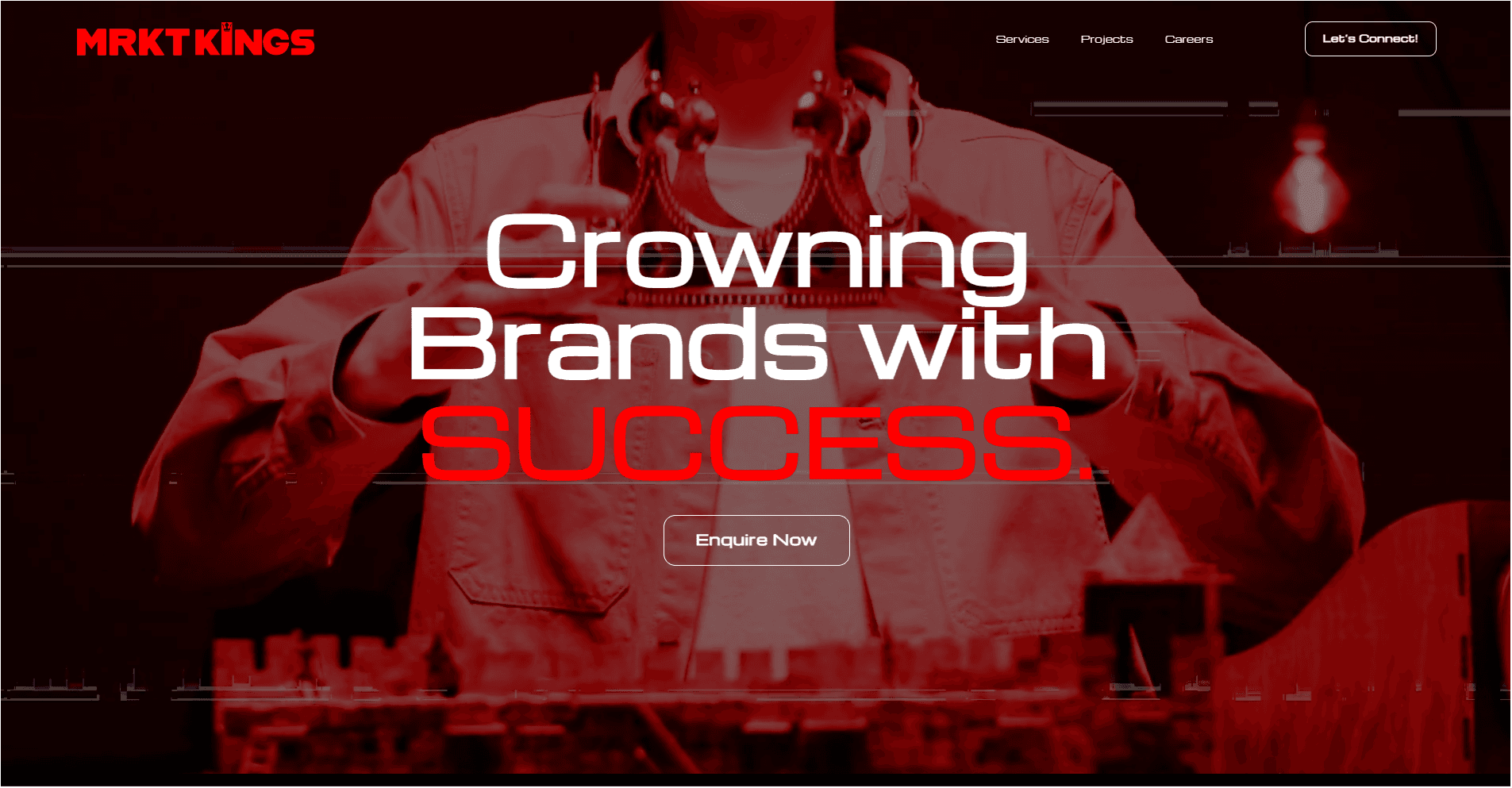
Conventional agency homepages lead with a service list or brand statement. I proposed leading the homepage with case study previews — showing outcomes before explaining capabilities. This aligned with how prospects actually evaluate agencies: they want evidence, not claims. It was a non-obvious IA decision that required convincing the client.
Typography as the primary differentiator
In a space where agencies compete primarily on photography and visual effects, I chose strong typographic hierarchy as the core brand differentiator. Type doesn't lag on scroll, doesn't degrade on mobile, isn't dependent on photography quality, and is far faster to update. This was a strategic decision about what kind of brand MRKTKings wanted to build — one that leads with clarity, not spectacle.
Outcomes
• Reduced CTA fragmentation from 11 variants to 2, creating a clear conversion architecture.
• Delivered a scalable case study system enabling the team to publish new work without design support.
What I'd Do Differently
Website redesigns are typically treated as final deliverables. I'd advocate harder for a post-launch iteration cycle — a 3-month check-in with real conversion data to identify what's working and what isn't. The highest-value version of this project would have been design + measurement + iteration, not a single handoff. That's a project scope conversation I'd have much earlier next time.

CASE STUDY
MRKTKings
MRKTKings is a marketing and branding agency that needed a modern, bold website that showcased their work, credibility, and unique value. The experience had to feel authoritative yet creative.
Role
Product Design Lead
Full redesign ownership
Industry
Marketing
Advertisement
Agency
Tools
UIUX Design
Web Design
Wordpress
Shopify
Live
MRKTKings
I redesigned a marketing agency's complete web presence — solving the most common agency problem: a site that described services without demonstrating them. A marketing agency whose own website failed at storytelling and conversion was losing the consideration battle before the first sales call. |
The Problem
User Problem
Prospective clients visiting MRKTKings were primarily asking one question: 'Can you do for us what you claim to do for others?' The previous site answered this poorly. Case studies were buried, service descriptions were generic, and there was no narrative connecting the agency's work to specific client outcomes. The site communicated competence — not capability.
Business Problem
MRKTKings was competing for mid-market clients evaluating 3–5 agencies simultaneously. First impressions were decisive. But the website wasn't making a distinctive case for the agency's approach or results. It looked like every other agency website, which meant it was being filtered out in the consideration phase before a conversation even started.
Discovery & Research
I conducted a content audit and competitive review of 8 comparably-sized agency websites. Key finding: most agencies described services identically — same language, same structure, same claims. The visual experience and proof of work were the only differentiators. I reviewed MRKTKings' strongest existing client work and sales materials to identify their genuine competitive strengths, then designed around making those visible.
Design Process
1. Restructuring the Prospect Journey
I restructured the site architecture around a prospect's actual decision process: Why this agency? → What do you actually do? → Show me proof → How do we start? The original navigation led with services (the least persuasive entry point) and buried case studies. I reversed the priority — proof first, credentials second.
2. Outcome-Led Service Pages
Each service page was redesigned around a pain-solution-outcome framework: opening with the problem clients typically bring, followed by the agency's approach, followed by specific outcomes with real work examples. This replaced generic capability statements with credible, relevant narratives.
3. Scalable Case Study System
I designed a case study card system with a fixed anatomy (client, challenge, approach, measurable result) enabling new work to be added without design support. The grid included filtering by industry and service type — allowing prospects in specific verticals to find relevant proof quickly.
4. CTA Consolidation
The previous site had 11 distinct call-to-action labels across pages — a fragmented conversion architecture. I reduced to 2 clear primary actions ('See our work' and 'Start a project'), placed at consistent decision points in the scroll journey. Fewer, clearer CTAs are consistently higher-converting than comprehensive menu options.
Key Decisions & Tradeoffs
Proof before services on the homepage
Conventional agency homepages lead with a service list or brand statement. I proposed leading the homepage with case study previews — showing outcomes before explaining capabilities. This aligned with how prospects actually evaluate agencies: they want evidence, not claims. It was a non-obvious IA decision that required convincing the client.
Typography as the primary differentiator
In a space where agencies compete primarily on photography and visual effects, I chose strong typographic hierarchy as the core brand differentiator. Type doesn't lag on scroll, doesn't degrade on mobile, isn't dependent on photography quality, and is far faster to update. This was a strategic decision about what kind of brand MRKTKings wanted to build — one that leads with clarity, not spectacle.
Outcomes
• Reduced CTA fragmentation from 11 variants to 2, creating a clear conversion architecture.
• Delivered a scalable case study system enabling the team to publish new work without design support.
What I'd Do Differently
Website redesigns are typically treated as final deliverables. I'd advocate harder for a post-launch iteration cycle — a 3-month check-in with real conversion data to identify what's working and what isn't. The highest-value version of this project would have been design + measurement + iteration, not a single handoff. That's a project scope conversation I'd have much earlier next time.