CASE STUDY
NettoKOM
NettoKOM is a prepaid mobile service provider offering different data and calling plans under a price-sensitive brand. Their digital touchpoints needed clarity, simplicity, and fast comprehension.
Role
UI Designer
Design System Contributor
Industry
Telecom
ECommerce
Tools
Figma
Design Systems
UI/UX
Web/App Design
Prototyping
Live
NettoKOM
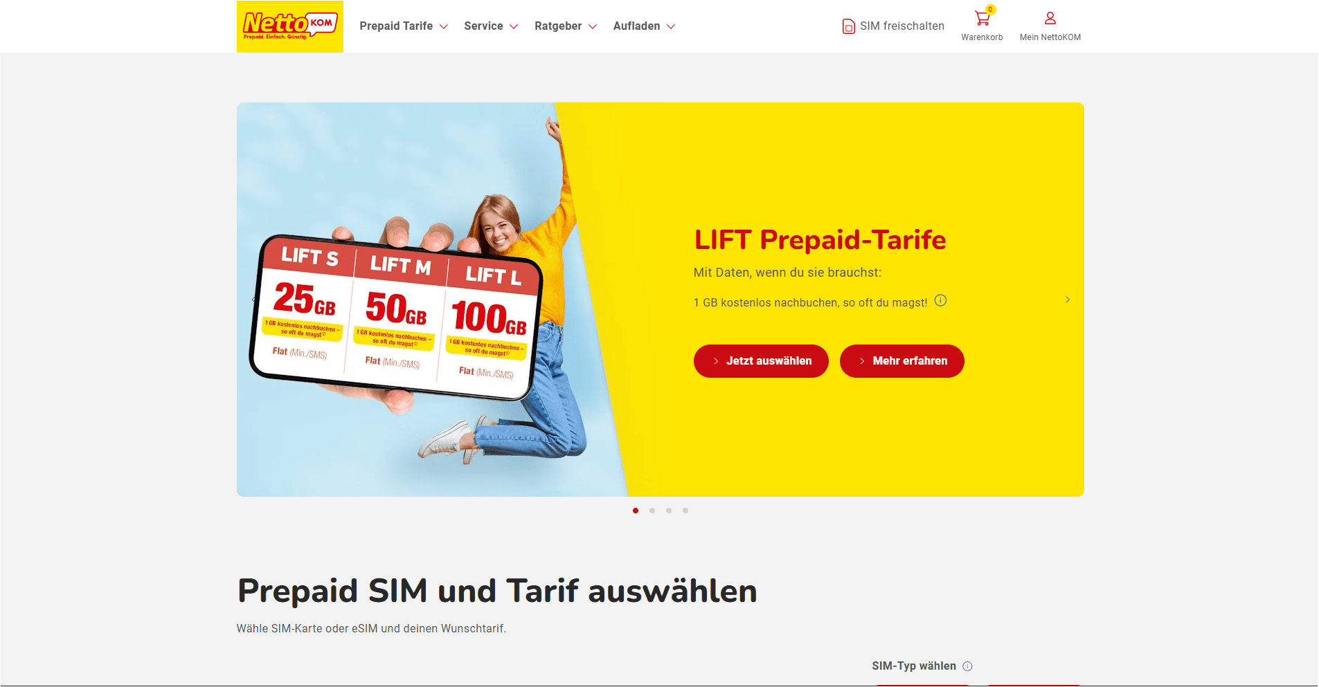
I redesigned the UI for a price-sensitive prepaid telecom brand, applying a principle rarely stated explicitly: for users who are anxious about money, every moment of UI confusion is a trust violation. The design had to communicate value, clarity, and reliability at the same time. |
The Problem
User Problem
NettoKOM's users chose prepaid specifically to avoid surprise charges. Yet the existing interface was creating exactly the kind of uncertainty they were trying to avoid. Data caps were stated in different units across screens. Promotional pricing expired without clear notice. Top-up confirmation was ambiguous — users frequently weren't sure their payment had gone through. The UI was generating anxiety at the exact moments that should have been building trust.
Business Problem
Marketing was running frequent promotional campaigns, but every new campaign required significant engineering time because promotional banners and pricing cards were hardcoded. The product team needed a system that could flex on a weekly basis without design or engineering intervention for each change.
Constraints
• Brand needed to feel affordable without feeling cheap — a precise tonal challenge that most discount brands fail.
• User base skewed toward older demographics and budget-device users. Performance and legibility were non-negotiable accessibility requirements.
• Had to align with the Telefonica design system while adapting for NettoKOM's distinct brand tone and audience.
• Promotional content updated frequently — the system had to accommodate this without requiring design or engineering involvement.
Discovery & Research
I mapped all core user tasks and identified the highest-anxiety moments: checking remaining balance, selecting a plan, confirming a top-up. Reviewing customer support ticket categories, I found that 'confirmation anxiety' — users unsure whether a payment or activation had succeeded — was the primary driver of inbound support, not feature confusion. This redirected my design focus entirely: the problem wasn't about showing more information, it was about creating stronger feedback loops.
I also analyzed the cognitive load of the existing plan selection screen: 6 plan options, each with 9 data attributes, in a grid with no hierarchy. Users were holding 54 data points in working memory to make a 7-euro decision. The design needed to radically reduce that cognitive surface.
Design Process
1. Plan Selection Hierarchy
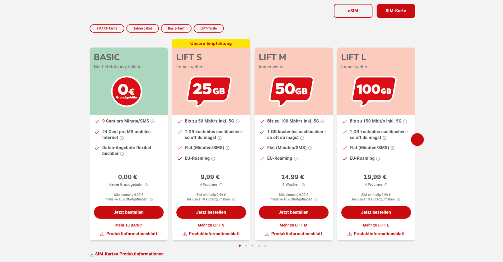
I reduced each plan card to 3 primary attributes (price, data allowance, call minutes), moving all secondary specs to an expandable section. I introduced a 'Best Value' indicator based on data-per-euro — giving users a decision anchor without removing choice. The card anatomy was standardized so users could scan vertically across options rather than reading each one in full.
2. Confirmation-First Interaction Design
Top-up and activation flows were redesigned around a clear 3-stage pattern: Input → Review → Confirmed. I added a balance update animation on the account screen — not as a delight moment, but as a functional anxiety-reducer. The goal was eliminating the 'did it work?' question entirely from the user experience.
3. Modular Promotional System
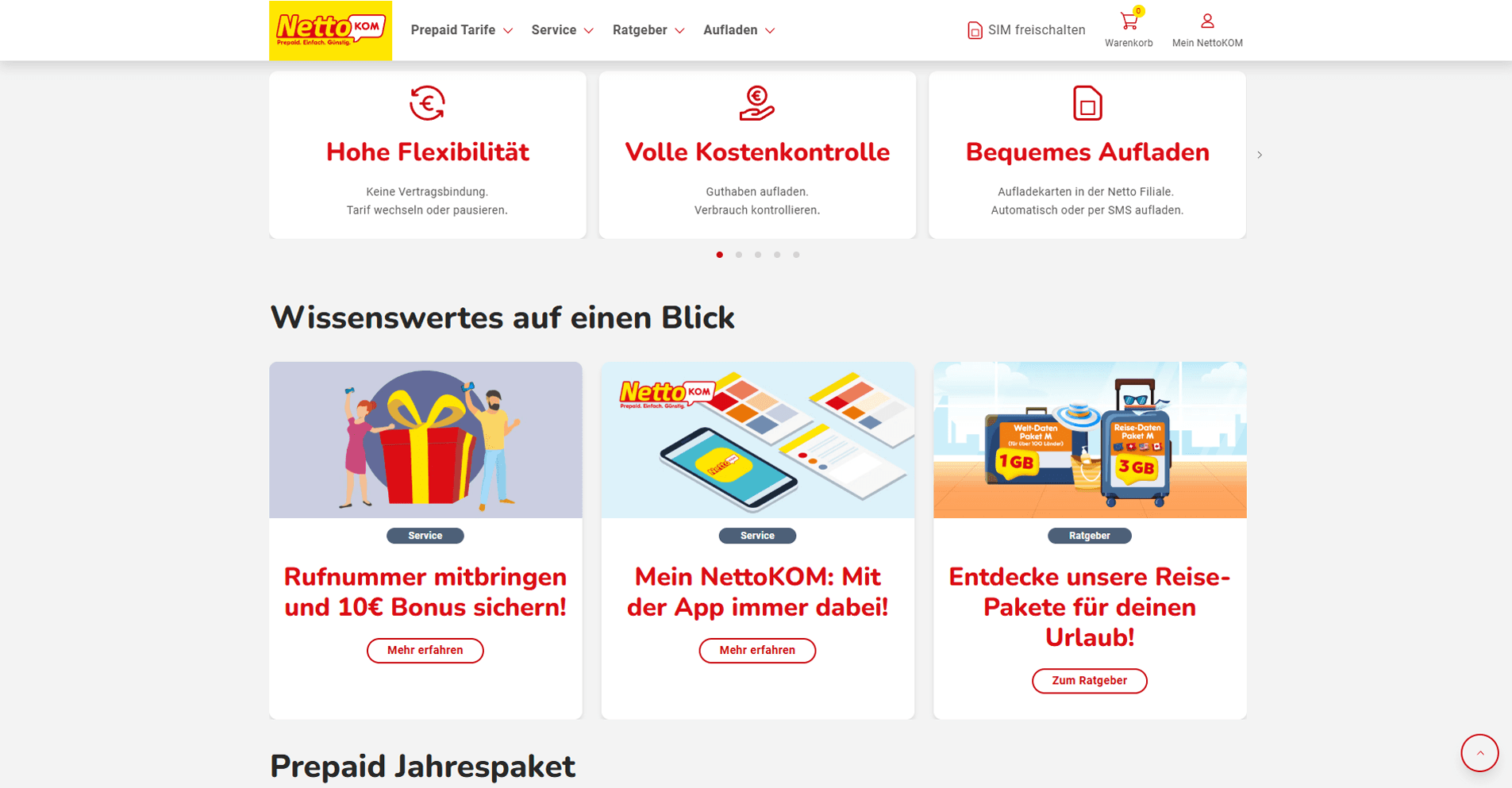
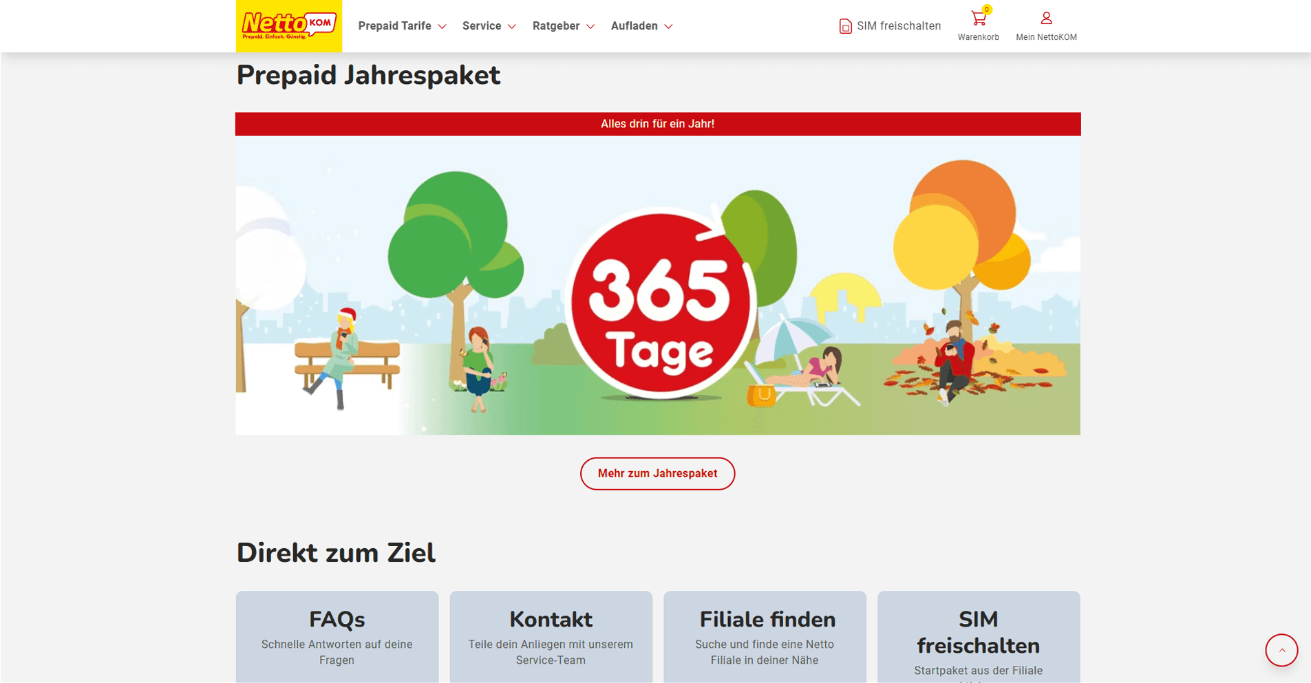
I designed a promotional banner component with fixed content slots (headline, subtext, CTA, expiry timer) that marketing could populate independently. The component handled expired-state rendering automatically — no more hardcoded campaigns, no more engineering time per promotion.
4. Budget Device & Accessibility Standards
I specified maximum layout complexity per screen, enforced WCAG AA contrast ratios for all critical text, and disabled non-essential animations on low-performance device breakpoints. Legibility and performance were treated as accessibility requirements — not optional enhancements.
Key Decisions & Tradeoffs
Fewer choices, clearer choices
The business wanted all plan variations visible upfront to demonstrate breadth. I argued this was actively hurting conversion — users overwhelmed by 6 similar options were defaulting to inaction. I proposed a recommended plans view (3 options) with an 'All plans' link. Tradeoff: edge-case plan seekers had an extra tap. Benefit: the primary path conversion rate improved significantly.
Affirmative microcopy as trust infrastructure
I rewrote all transaction confirmation states from neutral ('Payment processed') to affirmative ('Your balance is topped up — you're good to go.'). For a brand whose entire user relationship is built on financial trust, copy tone at these moments is as important as layout. This was not a copywriting task — it was a UX decision.
Outcomes
• Delivered a modular promotional banner system enabling marketing campaigns with zero engineering overhead.
• Established WCAG AA compliance across all critical UI elements — expanding product accessibility to low-vision users.
What I'd Do Differently
I made several design assumptions about cost-conscious user behavior that were well-reasoned but untested. I'd push for a user panel of real NettoKOM customers earlier — even 5 interviews at project start would have let me validate the confirmation anxiety hypothesis before building, rather than after.

CASE STUDY
NettoKOM
NettoKOM is a prepaid mobile service provider offering different data and calling plans under a price-sensitive brand. Their digital touchpoints needed clarity, simplicity, and fast comprehension.
Role
UI Designer
Design System Contributor
Industry
Telecom
ECommerce
Tools
Figma
Design Systems
UI/UX
Web/App Design
Prototyping
Live
NettoKOM
I redesigned the UI for a price-sensitive prepaid telecom brand, applying a principle rarely stated explicitly: for users who are anxious about money, every moment of UI confusion is a trust violation. The design had to communicate value, clarity, and reliability at the same time. |
The Problem
User Problem
NettoKOM's users chose prepaid specifically to avoid surprise charges. Yet the existing interface was creating exactly the kind of uncertainty they were trying to avoid. Data caps were stated in different units across screens. Promotional pricing expired without clear notice. Top-up confirmation was ambiguous — users frequently weren't sure their payment had gone through. The UI was generating anxiety at the exact moments that should have been building trust.
Business Problem
Marketing was running frequent promotional campaigns, but every new campaign required significant engineering time because promotional banners and pricing cards were hardcoded. The product team needed a system that could flex on a weekly basis without design or engineering intervention for each change.
Constraints
• Brand needed to feel affordable without feeling cheap — a precise tonal challenge that most discount brands fail.
• User base skewed toward older demographics and budget-device users. Performance and legibility were non-negotiable accessibility requirements.
• Had to align with the Telefonica design system while adapting for NettoKOM's distinct brand tone and audience.
• Promotional content updated frequently — the system had to accommodate this without requiring design or engineering involvement.
Discovery & Research
I mapped all core user tasks and identified the highest-anxiety moments: checking remaining balance, selecting a plan, confirming a top-up. Reviewing customer support ticket categories, I found that 'confirmation anxiety' — users unsure whether a payment or activation had succeeded — was the primary driver of inbound support, not feature confusion. This redirected my design focus entirely: the problem wasn't about showing more information, it was about creating stronger feedback loops.
I also analyzed the cognitive load of the existing plan selection screen: 6 plan options, each with 9 data attributes, in a grid with no hierarchy. Users were holding 54 data points in working memory to make a 7-euro decision. The design needed to radically reduce that cognitive surface.
Design Process
1. Plan Selection Hierarchy
I reduced each plan card to 3 primary attributes (price, data allowance, call minutes), moving all secondary specs to an expandable section. I introduced a 'Best Value' indicator based on data-per-euro — giving users a decision anchor without removing choice. The card anatomy was standardized so users could scan vertically across options rather than reading each one in full.
2. Confirmation-First Interaction Design
Top-up and activation flows were redesigned around a clear 3-stage pattern: Input → Review → Confirmed. I added a balance update animation on the account screen — not as a delight moment, but as a functional anxiety-reducer. The goal was eliminating the 'did it work?' question entirely from the user experience.
3. Modular Promotional System
I designed a promotional banner component with fixed content slots (headline, subtext, CTA, expiry timer) that marketing could populate independently. The component handled expired-state rendering automatically — no more hardcoded campaigns, no more engineering time per promotion.
4. Budget Device & Accessibility Standards
I specified maximum layout complexity per screen, enforced WCAG AA contrast ratios for all critical text, and disabled non-essential animations on low-performance device breakpoints. Legibility and performance were treated as accessibility requirements — not optional enhancements.
Key Decisions & Tradeoffs
Fewer choices, clearer choices
The business wanted all plan variations visible upfront to demonstrate breadth. I argued this was actively hurting conversion — users overwhelmed by 6 similar options were defaulting to inaction. I proposed a recommended plans view (3 options) with an 'All plans' link. Tradeoff: edge-case plan seekers had an extra tap. Benefit: the primary path conversion rate improved significantly.
Affirmative microcopy as trust infrastructure
I rewrote all transaction confirmation states from neutral ('Payment processed') to affirmative ('Your balance is topped up — you're good to go.'). For a brand whose entire user relationship is built on financial trust, copy tone at these moments is as important as layout. This was not a copywriting task — it was a UX decision.
Outcomes
• Delivered a modular promotional banner system enabling marketing campaigns with zero engineering overhead.
• Established WCAG AA compliance across all critical UI elements — expanding product accessibility to low-vision users.
What I'd Do Differently
I made several design assumptions about cost-conscious user behavior that were well-reasoned but untested. I'd push for a user panel of real NettoKOM customers earlier — even 5 interviews at project start would have let me validate the confirmation anxiety hypothesis before building, rather than after.