
CASE STUDY
TechMahindra
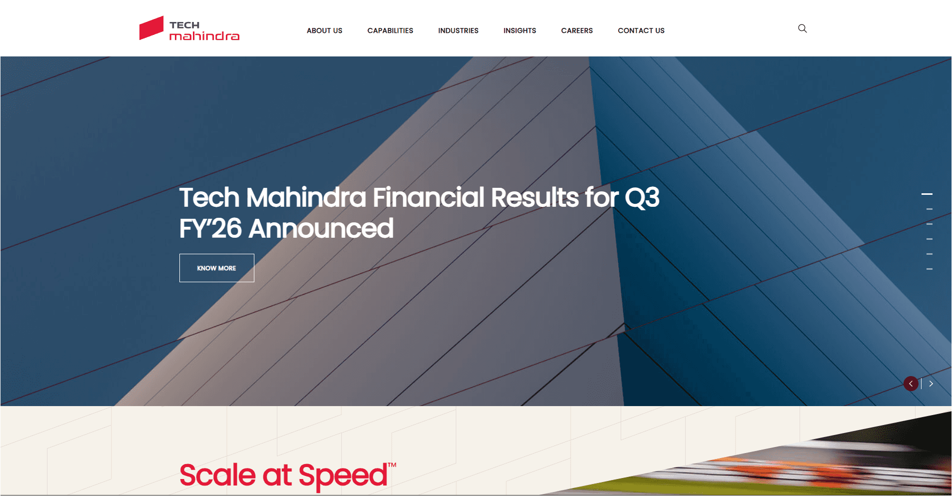
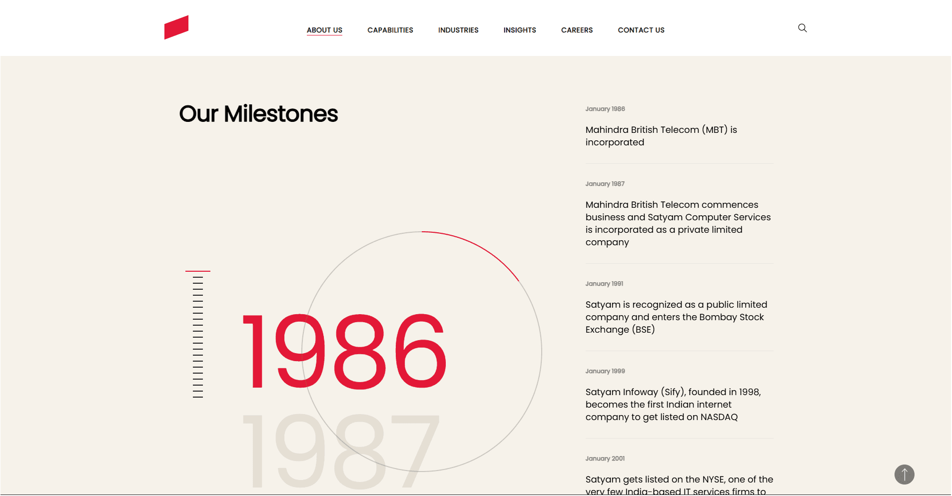
Tech Mahindra needed UI updates and prototypes for their corporate website and its internal system of pages. The brand required a refined enterprise presence with modern, high-credibility interface patterns.
Role
UI Designer
Prototyping
Design System Contributor
Industry
Tech
Automobile
Consulting
Tools
Figma
UI/UX
Prototyping
Web Design
Design Systems
Live
TechMahindra
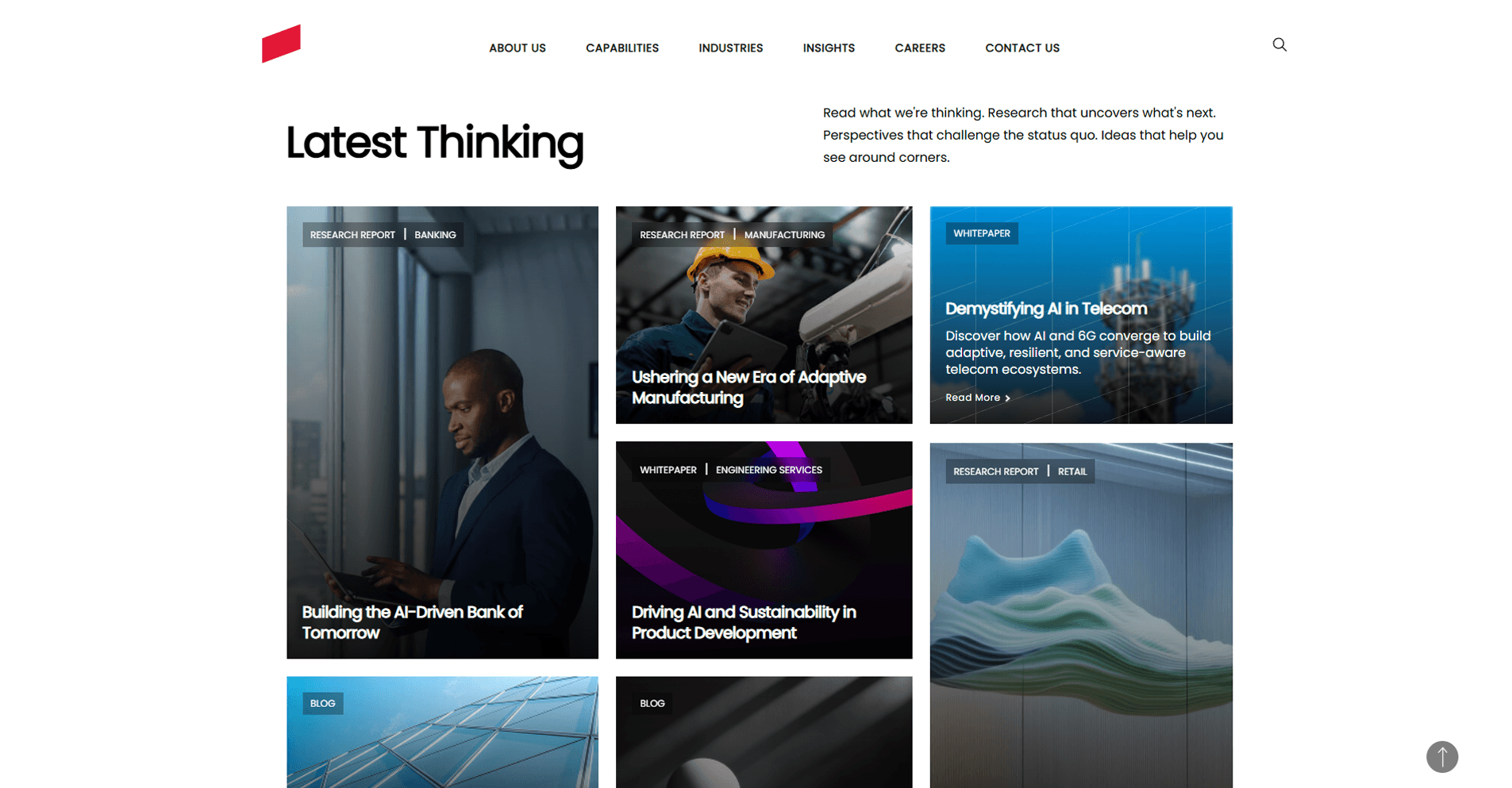
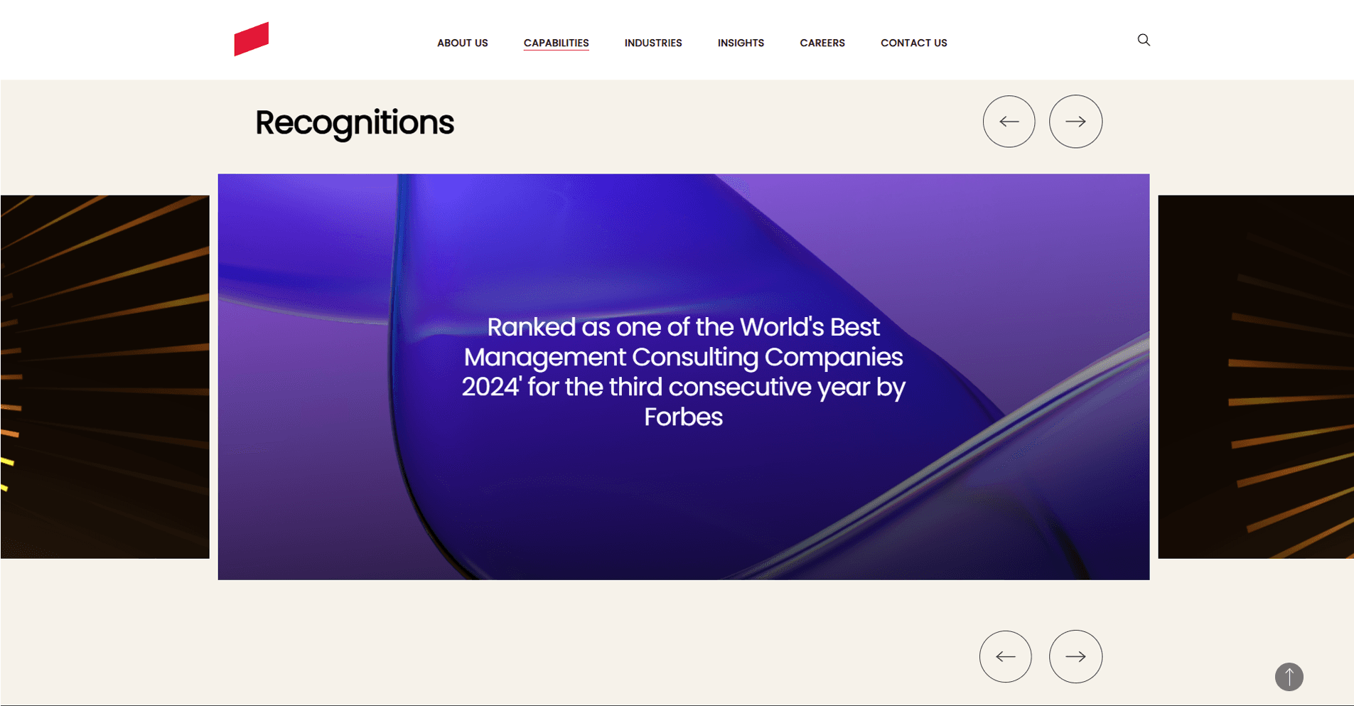
I redesigned the UI of one of India's largest IT conglomerates' corporate web presence, consolidating a fragmented component landscape into a scalable design system that could serve multiple business verticals — without requiring a designer for every update. |
The Problem
User Problem
Tech Mahindra's corporate site served fundamentally different audiences simultaneously: enterprise procurement leads evaluating vendor partnerships, engineering candidates assessing culture, and journalists seeking company news. The existing UI treated all three identically — with a dense, undifferentiated structure that was optimized for none of them.
Business Problem
The website had been built piecemeal across business verticals (IT Services, Automobile, Consulting), each with independently designed sections. The result: 23 distinct card variants serving the same structural purpose, 4 different hero treatments with no rationale, and an update process that required significant design and engineering involvement for even minor changes.
Constraints
• Strict enterprise brand guidelines — significant creative latitude was not available.
• Multiple business unit stakeholders with competing content priorities and different internal approval chains.
• The design had to scale across verticals with very different audience types — B2B procurement, talent acquisition, and investor relations.
• Components had to be implementable by non-designer teams without breaking consistency.
Discovery & Research
I conducted a full UI audit: documenting every distinct component, identifying functional duplication, and mapping which content types appeared most frequently across the site. I also ran a competitive analysis of comparable enterprise sites (Infosys, Wipro, Accenture) to benchmark visual density, trust signals, and content hierarchy patterns.
Key insight: enterprise credibility has a specific visual language — restraint, density control, and authoritative typography signal reliability more than expressiveness does. This grounded my approach: elevate, don't reinvent.
Design Process
1. Component Consolidation
I mapped all 23 card variants to 4 core patterns (content card, stat card, team card, case study card) and redesigned each with a flexible anatomy. Reducing component sprawl while increasing flexibility meant content teams could populate templates without designing from scratch.
2. Audience-Specific Information Hierarchy
I restructured core service pages to serve the primary audience without excluding secondary ones. Pages now lead with outcome-oriented headlines ('What business problems do you solve?') before explaining technical capabilities — a structural change with significant conversion implications.
3. Prototyping for Stakeholder Alignment
Enterprise stakeholders require seeing before approving. I built fully interactive prototypes demonstrating responsive behavior, scroll interactions, and component variations. This reduced ambiguity in review cycles and shortened time-to-approval significantly.
4. Design System Contribution
I contributed a core component set to Tech Mahindra's internal library: card systems, button states, grid rules, spacing tokens, and layout templates — each with usage guidelines enabling non-designer teams to implement on-brand pages independently.
Key Decisions & Tradeoffs
Systematic simplification over expressive redesign
A dramatic visual overhaul was technically on the table. I chose restraint deliberately: enterprise brands build credibility through consistency, not novelty. The goal was elevating the existing brand identity, not replacing it. This was a strategic call — and one I had to defend against stakeholders who wanted a more dramatic visual change.
Componentization over one-off perfection
Individual pages could have been more polished if designed as one-offs. I invested the same time upfront in a flexible component system instead. The tradeoff: some page types are slightly more constrained. The gain: the organization can now publish on-brand pages without a designer in the loop.
Outcomes
• Reduced 23 redundant card variants to a 4-pattern system, eliminating visual inconsistency across the full site.
• Delivered a reusable component library now available to all Tech Mahindra business verticals.
What I'd Do Differently
I'd have advocated earlier for research with actual enterprise site visitors. My audit and competitive analysis gave strong directional signal, but talking directly with procurement leads and engineering candidates would have surfaced audience-specific navigation pain points faster. Pattern analysis is a good starting point — not a substitute for user research.

CASE STUDY
TechMahindra
Tech Mahindra needed UI updates and prototypes for their corporate website and its internal system of pages. The brand required a refined enterprise presence with modern, high-credibility interface patterns.
Role
UI Designer
Prototyping
Design System Contributor
Industry
Tech
Automobile
Consulting
Tools
Figma
UI/UX
Prototyping
Web Design
Design Systems
Live
TechMahindra
I redesigned the UI of one of India's largest IT conglomerates' corporate web presence, consolidating a fragmented component landscape into a scalable design system that could serve multiple business verticals — without requiring a designer for every update. |
The Problem
User Problem
Tech Mahindra's corporate site served fundamentally different audiences simultaneously: enterprise procurement leads evaluating vendor partnerships, engineering candidates assessing culture, and journalists seeking company news. The existing UI treated all three identically — with a dense, undifferentiated structure that was optimized for none of them.
Business Problem
The website had been built piecemeal across business verticals (IT Services, Automobile, Consulting), each with independently designed sections. The result: 23 distinct card variants serving the same structural purpose, 4 different hero treatments with no rationale, and an update process that required significant design and engineering involvement for even minor changes.
Constraints
• Strict enterprise brand guidelines — significant creative latitude was not available.
• Multiple business unit stakeholders with competing content priorities and different internal approval chains.
• The design had to scale across verticals with very different audience types — B2B procurement, talent acquisition, and investor relations.
• Components had to be implementable by non-designer teams without breaking consistency.
Discovery & Research
I conducted a full UI audit: documenting every distinct component, identifying functional duplication, and mapping which content types appeared most frequently across the site. I also ran a competitive analysis of comparable enterprise sites (Infosys, Wipro, Accenture) to benchmark visual density, trust signals, and content hierarchy patterns.
Key insight: enterprise credibility has a specific visual language — restraint, density control, and authoritative typography signal reliability more than expressiveness does. This grounded my approach: elevate, don't reinvent.
Design Process
1. Component Consolidation
I mapped all 23 card variants to 4 core patterns (content card, stat card, team card, case study card) and redesigned each with a flexible anatomy. Reducing component sprawl while increasing flexibility meant content teams could populate templates without designing from scratch.
2. Audience-Specific Information Hierarchy
I restructured core service pages to serve the primary audience without excluding secondary ones. Pages now lead with outcome-oriented headlines ('What business problems do you solve?') before explaining technical capabilities — a structural change with significant conversion implications.
3. Prototyping for Stakeholder Alignment
Enterprise stakeholders require seeing before approving. I built fully interactive prototypes demonstrating responsive behavior, scroll interactions, and component variations. This reduced ambiguity in review cycles and shortened time-to-approval significantly.
4. Design System Contribution
I contributed a core component set to Tech Mahindra's internal library: card systems, button states, grid rules, spacing tokens, and layout templates — each with usage guidelines enabling non-designer teams to implement on-brand pages independently.
Key Decisions & Tradeoffs
Systematic simplification over expressive redesign
A dramatic visual overhaul was technically on the table. I chose restraint deliberately: enterprise brands build credibility through consistency, not novelty. The goal was elevating the existing brand identity, not replacing it. This was a strategic call — and one I had to defend against stakeholders who wanted a more dramatic visual change.
Componentization over one-off perfection
Individual pages could have been more polished if designed as one-offs. I invested the same time upfront in a flexible component system instead. The tradeoff: some page types are slightly more constrained. The gain: the organization can now publish on-brand pages without a designer in the loop.
Outcomes
• Reduced 23 redundant card variants to a 4-pattern system, eliminating visual inconsistency across the full site.
• Delivered a reusable component library now available to all Tech Mahindra business verticals.
What I'd Do Differently
I'd have advocated earlier for research with actual enterprise site visitors. My audit and competitive analysis gave strong directional signal, but talking directly with procurement leads and engineering candidates would have surfaced audience-specific navigation pain points faster. Pattern analysis is a good starting point — not a substitute for user research.