
CASE STUDY
WhatsApp SIM
WhatsApp SIM is a telecom product in the German market offering mobile services with WhatsApp-specific data advantages. The product had multiple customer journeys, plan variations, and digital touchpoints that needed cohesive UI patterns and fast experimentation.
Role
UI Designer
Design System Contributor
Industry
Telecom
ECommerce
Tools
Figma
Design Systems
UI/UX
Web/App Design
Prototyping
Live
WhatsApp SIM
I designed the end-to-end UI for a consumer telecom product in Germany — plan selection, SIM onboarding, activation, account management — while contributing reusable components to Telefonica's shared design system used across multiple brands. |
The Problem
User Problem
Choosing a mobile plan online is cognitively expensive. Users face jargon-heavy pricing, opaque data caps, and multi-step activation flows — and they make this decision once, under uncertainty. WhatsApp SIM had an additional complication: its core differentiator (a WhatsApp-specific data benefit) was consistently misunderstood by users, who thought it was a WhatsApp partnership product or a separate SIM type — not a data allocation feature.
Business Problem
The product team needed to run rapid pricing and onboarding experiments, but the existing UI was too bespoke to flex. Each pricing experiment required significant engineering rework. The design system had to become modular enough to support experimentation as a product capability, not just a one-off effort.
Constraints
• All UI had to align with Telefonica's existing design system — I could extend it, not replace it.
• German regulatory requirements mandated specific identity verification steps in the SIM activation flow that could not be simplified away.
• The product needed to support multiple concurrent pricing experiments with minimal incremental design effort.
• I collaborated with PMs and engineers across time zones, requiring async-first design communication.
Discovery & Research
I mapped all user journeys end-to-end: plan discovery, comparison, purchase, SIM activation, number registration, and account management — documenting 14 distinct touchpoints. I identified 3 high-friction zones: plan comparison (users couldn't differentiate plans), SIM activation (too many steps, no progress visibility), and top-up confirmation (users weren't confident their payment registered).
I reviewed session recordings and customer support ticket categories provided by the product team to validate which friction points generated the most drop-off and inbound support volume. This grounded design priorities in behavior, not assumption.
Design Process
1. Modular Plan Selector
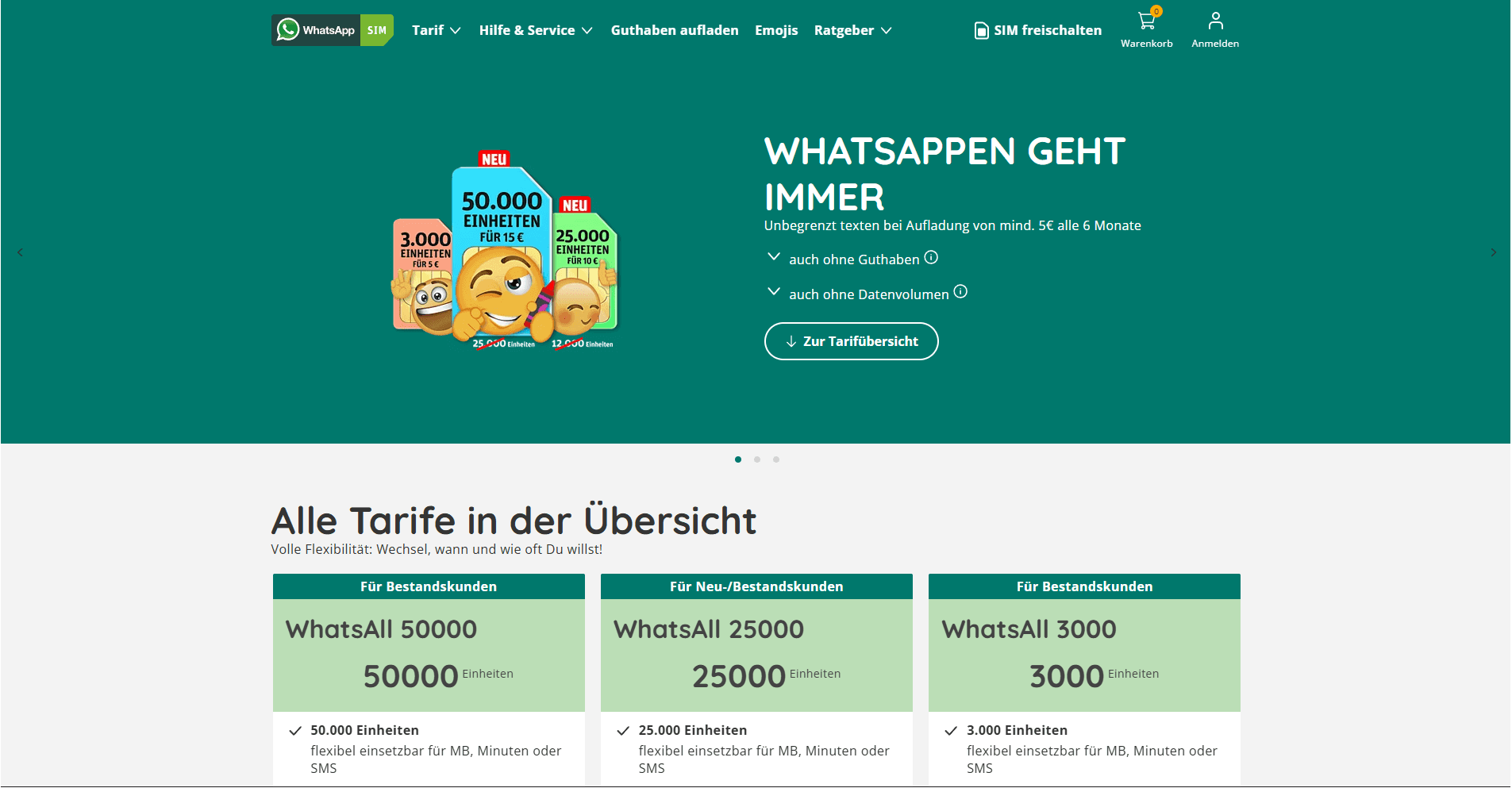
I redesigned the plan comparison module as a configurable card system. Each card had a fixed anatomy (price anchor, primary benefit, data allowance, CTA) so new plan variations could be introduced by swapping content, not restructuring layout. Using Figma variables, a single component covered all pricing experiment states.
2. Simplified SIM Activation Flow
The existing activation flow had 9 steps with no progress visibility. I reduced it to 5 logical phases and introduced a persistent progress header. Critically, I separated the regulatory identity verification step from the account setup steps — making the friction feel expected and purposeful rather than arbitrary.
3. Design System Contributions
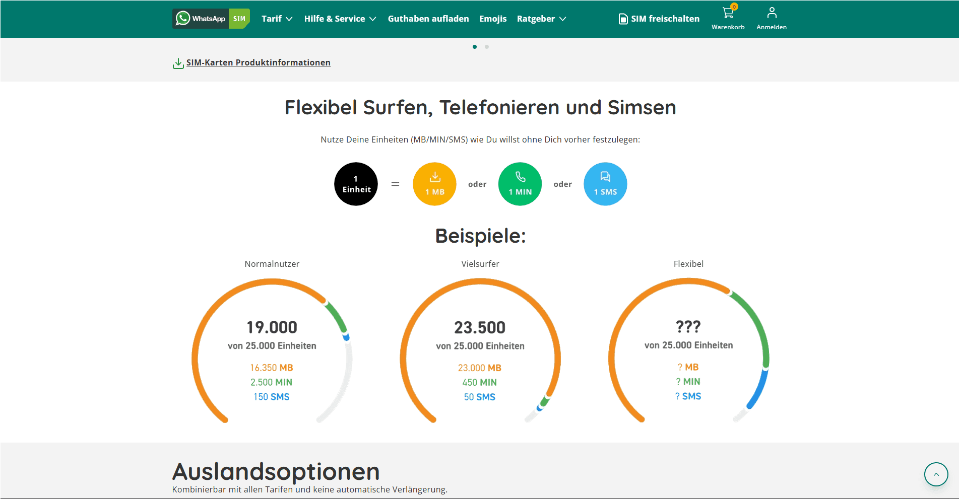
I identified 6 UI patterns present in WhatsApp SIM but absent from Telefonica's shared library: plan selectors, usage meters, contextual help modules, promotional banners with expiry countdowns, top-up confirmation states, and step progress headers. I documented all 6 as system proposals and contributed 4 after alignment with the platform team.
4. Cross-Functional Collaboration
I worked directly with UX researchers running usability tests on prototype flows, with engineers on interaction feasibility, and with the legal/compliance team on identity verification copy — ensuring it met regulatory requirements without creating unnecessary anxiety in the user experience.
Key Decisions & Tradeoffs
Progressive disclosure on plan detail
The business wanted all plan specs visible upfront. I argued this harmed conversion: surfacing every spec upfront created analysis paralysis. I designed a 3-attribute default view (price, data, WhatsApp benefit) with an expandable details section. Tradeoff: one extra tap for detail-oriented users. Benefit: the primary decision path became significantly cleaner.
Motion as functional feedback, not decoration
Users weren't confident their top-up registered — this was a trust problem, not a UI problem. I introduced a brief success animation on the balance widget specifically to eliminate the 'did it work?' anxiety. Every animation on this product had a functional justification documented in the component spec.
Outcomes
• Contributed to Telefonica's shared design system, now available across brands.
• Enabled the product team to run new pricing experiments with zero incremental design effort.
What I'd Do Differently
The WhatsApp brand association created a persistent mental model problem I never fully resolved in the UI alone. In retrospect, I'd have pushed harder for a product education moment at first activation — a single contextual tooltip setting the right mental model before users reached the plan selector. I prioritized flow clarity over user education, and that was the wrong tradeoff for this product.

CASE STUDY
WhatsApp SIM
WhatsApp SIM is a telecom product in the German market offering mobile services with WhatsApp-specific data advantages. The product had multiple customer journeys, plan variations, and digital touchpoints that needed cohesive UI patterns and fast experimentation.
Role
UI Designer
Design System Contributor
Industry
Telecom
ECommerce
Tools
Figma
Design Systems
UI/UX
Web/App Design
Prototyping
Live
WhatsApp SIM
I designed the end-to-end UI for a consumer telecom product in Germany — plan selection, SIM onboarding, activation, account management — while contributing reusable components to Telefonica's shared design system used across multiple brands. |
The Problem
User Problem
Choosing a mobile plan online is cognitively expensive. Users face jargon-heavy pricing, opaque data caps, and multi-step activation flows — and they make this decision once, under uncertainty. WhatsApp SIM had an additional complication: its core differentiator (a WhatsApp-specific data benefit) was consistently misunderstood by users, who thought it was a WhatsApp partnership product or a separate SIM type — not a data allocation feature.
Business Problem
The product team needed to run rapid pricing and onboarding experiments, but the existing UI was too bespoke to flex. Each pricing experiment required significant engineering rework. The design system had to become modular enough to support experimentation as a product capability, not just a one-off effort.
Constraints
• All UI had to align with Telefonica's existing design system — I could extend it, not replace it.
• German regulatory requirements mandated specific identity verification steps in the SIM activation flow that could not be simplified away.
• The product needed to support multiple concurrent pricing experiments with minimal incremental design effort.
• I collaborated with PMs and engineers across time zones, requiring async-first design communication.
Discovery & Research
I mapped all user journeys end-to-end: plan discovery, comparison, purchase, SIM activation, number registration, and account management — documenting 14 distinct touchpoints. I identified 3 high-friction zones: plan comparison (users couldn't differentiate plans), SIM activation (too many steps, no progress visibility), and top-up confirmation (users weren't confident their payment registered).
I reviewed session recordings and customer support ticket categories provided by the product team to validate which friction points generated the most drop-off and inbound support volume. This grounded design priorities in behavior, not assumption.
Design Process
1. Modular Plan Selector
I redesigned the plan comparison module as a configurable card system. Each card had a fixed anatomy (price anchor, primary benefit, data allowance, CTA) so new plan variations could be introduced by swapping content, not restructuring layout. Using Figma variables, a single component covered all pricing experiment states.
2. Simplified SIM Activation Flow
The existing activation flow had 9 steps with no progress visibility. I reduced it to 5 logical phases and introduced a persistent progress header. Critically, I separated the regulatory identity verification step from the account setup steps — making the friction feel expected and purposeful rather than arbitrary.
3. Design System Contributions
I identified 6 UI patterns present in WhatsApp SIM but absent from Telefonica's shared library: plan selectors, usage meters, contextual help modules, promotional banners with expiry countdowns, top-up confirmation states, and step progress headers. I documented all 6 as system proposals and contributed 4 after alignment with the platform team.
4. Cross-Functional Collaboration
I worked directly with UX researchers running usability tests on prototype flows, with engineers on interaction feasibility, and with the legal/compliance team on identity verification copy — ensuring it met regulatory requirements without creating unnecessary anxiety in the user experience.
Key Decisions & Tradeoffs
Progressive disclosure on plan detail
The business wanted all plan specs visible upfront. I argued this harmed conversion: surfacing every spec upfront created analysis paralysis. I designed a 3-attribute default view (price, data, WhatsApp benefit) with an expandable details section. Tradeoff: one extra tap for detail-oriented users. Benefit: the primary decision path became significantly cleaner.
Motion as functional feedback, not decoration
Users weren't confident their top-up registered — this was a trust problem, not a UI problem. I introduced a brief success animation on the balance widget specifically to eliminate the 'did it work?' anxiety. Every animation on this product had a functional justification documented in the component spec.
Outcomes
• Contributed to Telefonica's shared design system, now available across brands.
• Enabled the product team to run new pricing experiments with zero incremental design effort.
What I'd Do Differently
The WhatsApp brand association created a persistent mental model problem I never fully resolved in the UI alone. In retrospect, I'd have pushed harder for a product education moment at first activation — a single contextual tooltip setting the right mental model before users reached the plan selector. I prioritized flow clarity over user education, and that was the wrong tradeoff for this product.